Forrest Hoffman, Bill Hargrove, David Erickson, Bob Oglesby
January 11, 2002
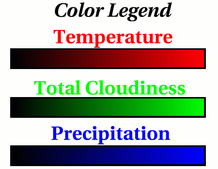
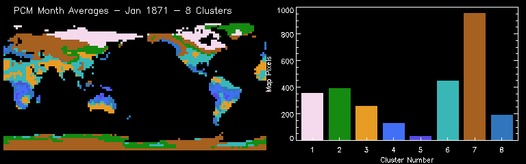
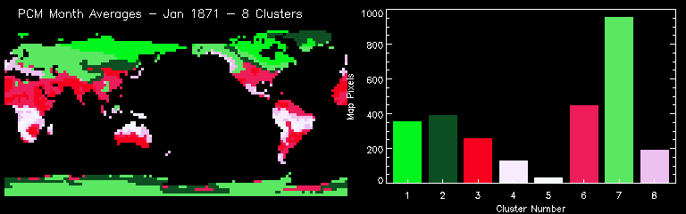
The PCM data used in the previous analyses (see Evolution of Clusters Through Time) was re-clustered in 8 different categories in an attempt to simplify the previous results. The ocean and sea ice cells were removed prior to this clustering so only the 2,796 land cells out of the 8,192 total cells for each month were used. The data were not regularized; the original gaussian grid was retained. Randomly colored animations and similarity colored animations were created from the clustering results. To make sense of the similarity colored results, see the Color Legend. A single frame from each animation is shown here.
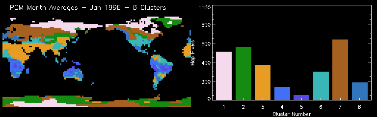
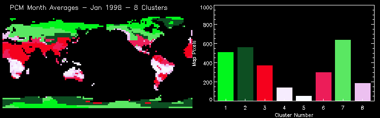
The following table shows the mean characteristics of each of the 8 clusters or environmental regimes. The colors in the table match the similarity colors in the plots and maps.
| Cluster Number |
Cloud Cover [%] |
Precipitation [× 10-7 kg m-2 s-1] |
Temperature [K] |
|---|---|---|---|
| 1 | 0.8855 | 0.0270 | 226.52 |
| 2 | 0.5726 | 0.0454 | 243.62 |
| 3 | 0.1467 | 0.0272 | 293.03 |
| 4 | 0.8074 | 0.8917 | 294.12 |
| 5 | 0.9256 | 1.5640 | 296.33 |
| 6 | 0.4740 | 0.1460 | 286.38 |
| 7 | 0.7856 | 0.1561 | 263.10 |
| 8 | 0.6879 | 0.4122 | 285.85 |
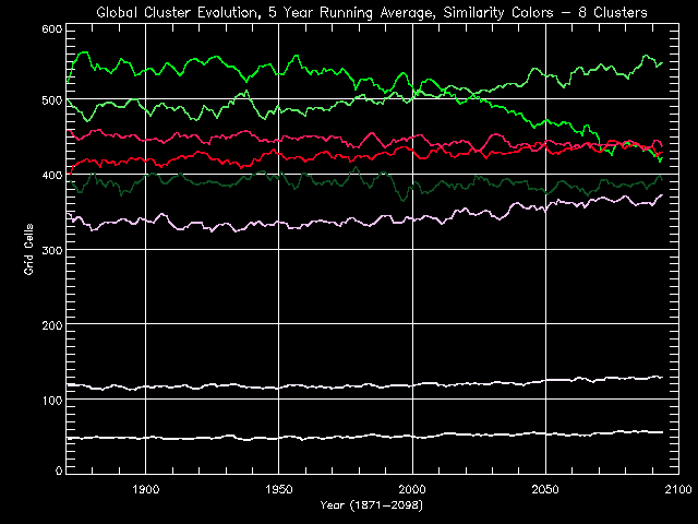
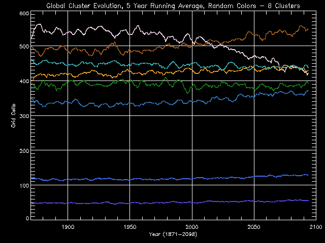
The evolution of these clusters as 5 year running averages is plotted in order to see trends. The histogram results for each month were averaged 5 years at a time from 1871 through 2098. These Global Cluster Evolution curves are shown in the figures below in both random and similarity colors. As seen previously, the predominant Antarctic cluster shows a continual decline throughout the period pointing to significant environmental changes at the South Pole.
As clusters evolve through time, their spatial extent and distribution on the land changes. The differences in spatial extent can be seen by mapping cluster changes using a red-yellow-green gradient we call "stop light" colors. If the cluster grew (in number of grid cells) between the first point in time (say Jan 1898) and the second point in time (say Jan 1998), then those grid cells are colored green. If the cluster shrank between time A and time B, then the grid cells representing that cluster are colored red. Yellow is used to color clusters which exhibited no change between time A and time B. The distribution of the cluster is not considered so if the cluster moves or breaks into pieces but still occupies the same number of cells, then it would be colored yellow. Of course we use a gradient so orange is a medium-sized shinking and lime is a medium-sized growing. Pure red is the largest shrinking and pure green is the largest increase.
To compare the change in distribution between the two point in time, look up and down. To see what clusters are represented in the change maps, look left and right.