Forrest Hoffman, Bill Hargrove, David Erickson, Bob Oglesby
September 6, 2001
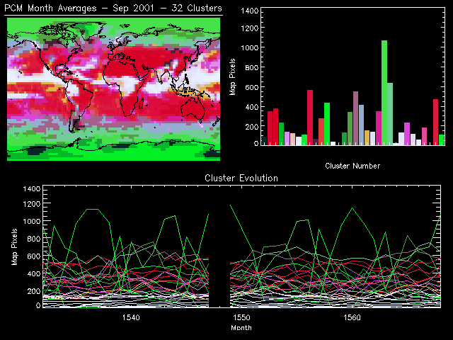
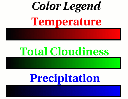
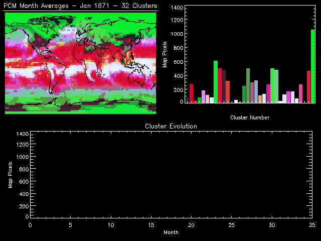
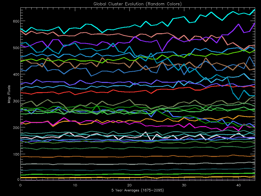
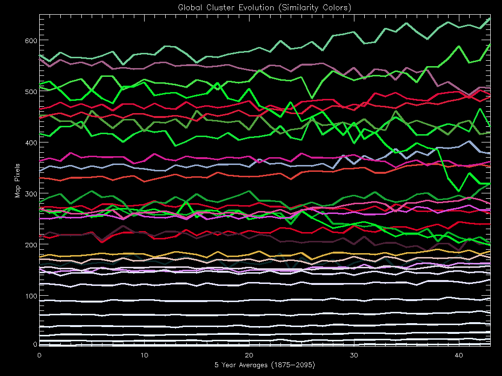
The same cluster results (see An Introductory Clustering of PCM Results) were used to generate the following images and animations of cluster evolution through time for the simulated time period 1871-2098. In the animations, the cluster map is presented in the upper left of the frame while the instantaneous cluster histogram (representing total map pixels) is presented in the upper right. In the bottom of the frame a moving strip chart, containing 36 months of data at any time, shows the evolution of each cluster through time. Animations were generated using both random and similarity colors. To make sense of the similarity colored results, see the Color Legend. A single frame from each animation is shown here. The missing values in the strip charts are a result of bad data for January 2000 (see discussion below).
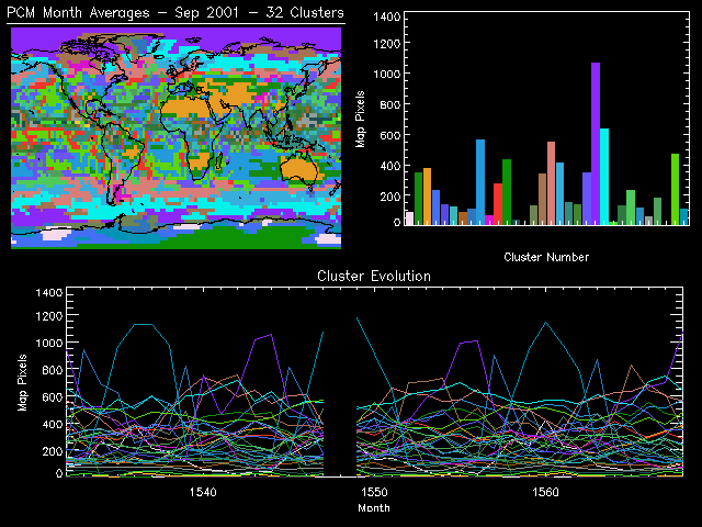
WARNING: The MPEG movie files are very large and take a considerable amount of time to download. To quickly view the animations in a Web browser, select the Animated GIFs below.
The following table shows the mean characteristics of each of the 32 clusters or environmental regimes. The colors in the table match the similarity colors in the plots and maps.
| Cluster Number |
Cloud Cover [%] |
Precipitation [× 10-7 kg m-2 s-1] |
Temperature [K] |
|---|---|---|---|
| 1 | 48.86 | 0.03 | 241.15 |
| 2 | 21.12 | 0.05 | 292.29 |
| 3 | 5.50 | 0.01 | 294.31 |
| 4 | 72.80 | 0.03 | 232.37 |
| 5 | 66.44 | 0.84 | 294.91 |
| 6 | 75.07 | 0.43 | 299.03 |
| 7 | 91.41 | 1.44 | 300.72 |
| 8 | 87.94 | 0.12 | 251.43 |
| 9 | 32.52 | 0.12 | 295.62 |
| 10 | 45.96 | 0.10 | 269.17 |
| 11 | 55.47 | 0.11 | 296.18 |
| 12 | 93.90 | 0.01 | 214.20 |
| 13 | 95.91 | 2.01 | 301.77 |
| 14 | 98.48 | 2.72 | 302.71 |
| 15 | 69.41 | 0.10 | 252.22 |
| 16 | 69.29 | 0.14 | 270.79 |
| 17 | 61.18 | 0.31 | 281.73 |
| 18 | 70.73 | 0.51 | 279.74 |
| 19 | 72.20 | 0.15 | 296.79 |
| 20 | 84.68 | 0.94 | 299.04 |
| 21 | 44.56 | 0.33 | 293.29 |
| 22 | 85.05 | 0.16 | 268.59 |
| 23 | 77.72 | 0.33 | 275.14 |
| 24 | 97.45 | 2.33 | 302.28 |
| 25 | 86.24 | 1.19 | 300.15 |
| 26 | 57.23 | 0.57 | 294.22 |
| 27 | 81.09 | 0.68 | 298.84 |
| 28 | 93.89 | 1.71 | 301.20 |
| 29 | 57.55 | 0.33 | 297.66 |
| 30 | 99.09 | 3.29 | 303.11 |
| 31 | 43.58 | 0.12 | 295.39 |
| 32 | 93.03 | 0.04 | 237.59 |
The evolution of these clusters throughout the entire time period (1871-2098) is of particular interest. In order to get a sense of the trends of these clusters over this time period, the histogram results were averaged in 5 year increments from 1875 through 2095. These Global Cluster Evolution curves are shown in the figures below in both random and similarity colors. A particularly interesting cluster undergoes a precipitous decline; starting at 515 map pixels it slowly drops during the historical period and then quickly falls for the remaining period ending at 320 map pixels. Although we have not fully analyzed the impacts of the change, we know that this cluster represents the present-day climate regime of Antarctica and that it is displaced by one or more other clusters. This means that significant changes are predicted to occur at the South Pole.