Forrest Hoffman, Bill Hargrove, David Erickson, Bob Oglesby
January 17, 2002
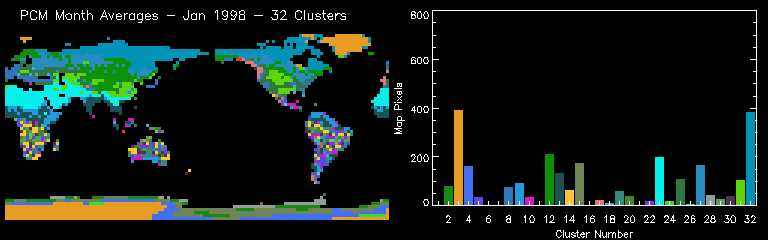
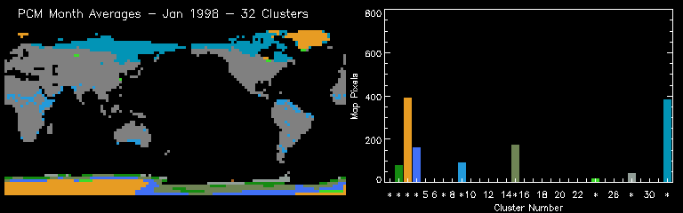
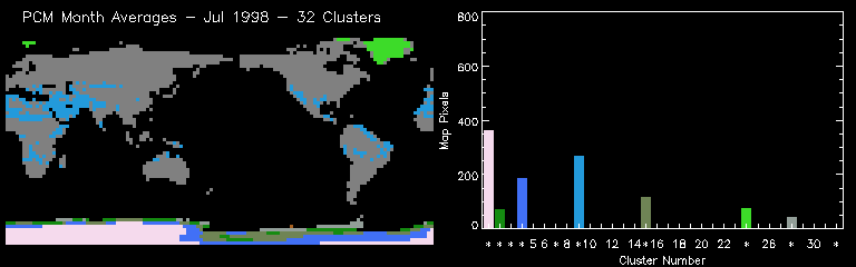
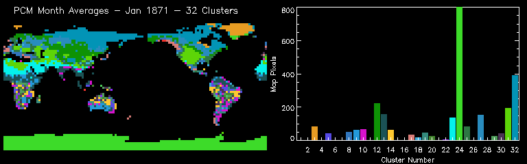
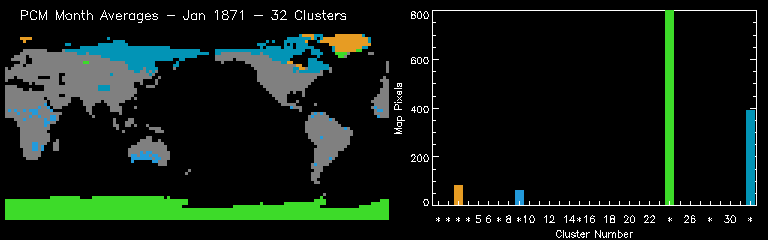
This analysis is aimed at following the water budget using PCM data for the same years used in previous analyses. In order to better account for the distribution of water over this 200 year period, four fields from the PCM model were used: surface temperature [K] (as before), precipitation [kg m-2 s-1] (as before), soil moisture [volume fraction] (LSM root zone volumetric soil water), and snow depth [m] (water equivalent). The ocean and sea ice cells were removed prior to this clustering so only the 2,796 land cells out of the 8,192 total cells for each month were used. The data were not regularized; the original gaussian grid was retained. A randomly colored animation of the clustering results is available below.
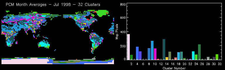
The following table shows the mean characteristics of each of the 32 clusters or environmental regimes. The colors in the table match the random colors in the plots and maps. The table is sorted by temperature, precipitation, soil moisture, and snow depth.
| Cluster Number |
Temperature [K] |
Precipitation [× 10-7 kg m-2 s-1] |
Soil Moisture [Vol Frac] |
Snow Depth [m] |
Name |
|---|---|---|---|---|---|
| - 1 | 212.87 | 0.01 | 1.00 | 2.83 | Antarctic winter |
| *+- 4 | 233.60 | 0.03 | 1.00 | 10.76 | New Antarctic ring |
| - 3 | 237.22 | 0.03 | 1.00 | 2.44 | Antarctic summer & Greenland winter |
| - 32 | 241.91 | 0.05 | 0.23 | 0.09 | Siberia & N. Canada winter |
| *+ 15 | 243.65 | 0.06 | 1.00 | 19.70 | New Antarctic ring |
| *+ 2 | 245.67 | 0.09 | 1.00 | 33.59 | New Antarctic ring |
| *+ 28 | 248.04 | 0.12 | 1.00 | 53.21 | New Antacrtic ring |
| *+ 7 | 252.21 | 0.16 | 1.00 | 82.28 | New Antarctic ring |
| 12 | 257.87 | 0.11 | 0.22 | 0.08 | |
| - 24 | 259.17 | 0.10 | 0.99 | 1.96 | Greenland summer & Antarctic coastal summer |
| 27 | 259.47 | 0.13 | 0.47 | 0.07 | |
| 11 | 272.91 | 0.42 | 0.95 | 0.28 | |
| 31 | 273.45 | 0.11 | 0.29 | 0.01 | |
| 25 | 275.39 | 0.24 | 0.26 | 0.02 | |
| 17 | 277.85 | 0.59 | 0.30 | 0.02 | |
| 8 | 278.16 | 0.39 | 0.30 | 0.01 | |
| 18 | 281.11 | 0.25 | 0.51 | 0.00 | |
| 23 | 283.27 | 0.03 | 0.14 | 0.00 | |
| 10 | 292.97 | 0.17 | 0.23 | 0.00 | |
| 30 | 294.11 | 0.86 | 0.34 | 0.00 | |
| 5 | 294.82 | 0.49 | 0.30 | 0.00 | |
| 19 | 295.13 | 0.32 | 0.24 | 0.00 | |
| 20 | 295.34 | 1.05 | 0.36 | 0.00 | |
| 6 | 295.93 | 2.24 | 0.39 | 0.00 | |
| 29 | 295.93 | 1.25 | 0.37 | 0.00 | |
| 14 | 296.13 | 0.68 | 0.30 | 0.00 | |
| 22 | 296.38 | 1.45 | 0.39 | 0.00 | |
| 16 | 296.43 | 1.91 | 0.40 | 0.00 | |
| 26 | 296.57 | 1.67 | 0.40 | 0.00 | |
| 21 | 296.71 | 2.81 | 0.39 | 0.00 | |
| 13 | 297.44 | 0.03 | 0.27 | 0.00 | |
| + 9 | 298.58 | 0.02 | 0.10 | 0.00 | Desert |
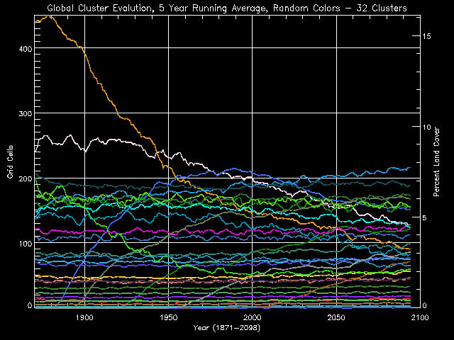
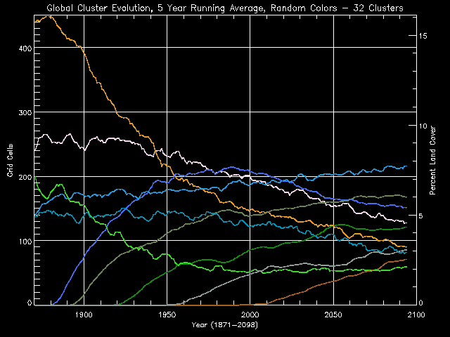
The evolution of these clusters as 5 year running averages is plotted in order to see trends. The histogram results for each month were averaged 5 years at a time from 1871 through 2098. These Global Cluster Evolution curves are shown in the figure above using random colors. It is evident that a few clusters decline in area by a significant amount while other clusters are "born" (come into existence) as the run progresses. This signifies a changing set of environmental conditions over the 200 years. The newborn clusters represent combinations of environmental conditions on Earth which did not exist before.
Eliminating all the clusters which do not exibit significant changes, by thresholding the variance at 100 cells for the entire period, another graph, shown below, contains only the changing clusters. These ten clusters of interest may now be analyzed to understand global environmental changes as predicted by the PCM model scenario.
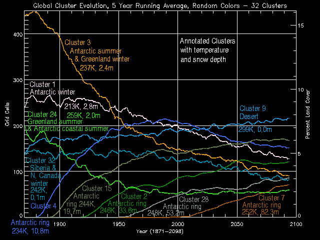
Another animation of the clustering results was produced which included only the 10 clusters of interest (as determined by the 5 year running average distribution plot above). These clusters of interest are mapped so that changes in their spatial areas can be observed from each of the monthly PCM results. The cluster numbers for the clusters of interest are represented by an asterisk (*) in the histogram plot in the figures and animation below.
As clusters evolve through time, their spatial extent and distribution on the land changes. The differences in global spatial extent can be seen by mapping cluster changes using a red-yellow-green gradient we call "stop light" colors. If the cluster grew (in number of grid cells) between the first point in time (say Jan 1898) and the second point in time (say Jan 1998), then those grid cells are colored green. If the cluster shrank between time A and time B, then the grid cells representing that cluster are colored red. Yellow is used to color clusters which exhibited no change between time A and time B. The distribution of the cluster is not considered so if the cluster moves or breaks into pieces but still occupies the same number of cells, then it would be colored yellow. Of course we use a gradient so orange is a medium-sized shinking and lime is a medium-sized growing. Pure red is the largest shrinking and pure green is the largest increase.
Included are the area change maps on the left and the random cluster maps and histograms on the right. On the right, both the complete cluster maps and the maps of only the clusters of interest are presented. To compare the change in distribution between the two point in time, look up and down. To see what clusters are represented in the change maps, look left and right.
Because individual months 100 years apart may not be a good representation of the over-all trend or the seasonal behavior, we decided to create three new seasonal snapshots by averaging 3 months for 10 years which were 100 years apart. We chose to investigate the winter season--using December, January, and February (DJF)--and the summer season--using June, July, and August (JJA). Data for these three months were averaged for each season for three time periods: 1889-1898, 1989-1998, and 2089-2098. This resulted in a new "derived" model output dataset for each season, each containing three maps.
These data was standardized using the means and standard deviations of the original complete dataset and then classified by performing a single-pass clustering using the centroids obtained in the inital clustering described above. The resulting classification maps for each time period are available here:
Changes in cluster spatial area were calculated using these derived classifications. These changes were mapped, as before, using stop-light colors.
Included are the area change maps on the left and the random cluster maps and histograms on the right. To compare the change in distribution between the two point in time, look up and down. To see what clusters are represented in the change maps, look left and right.
The same procedure for plotting cluster evolution used above was applied to each continent resulting in individual cluster evolution plots for each continent. Five year running averages of cluster population were calculated for the entire study period and plotted separately for each continent. A second plot was made for each continent containing only the curves which exhibited more than a 1% change in continental spatial area. This thresholding eliminates curves for clusters which do not undergo a significant change in spatial area.